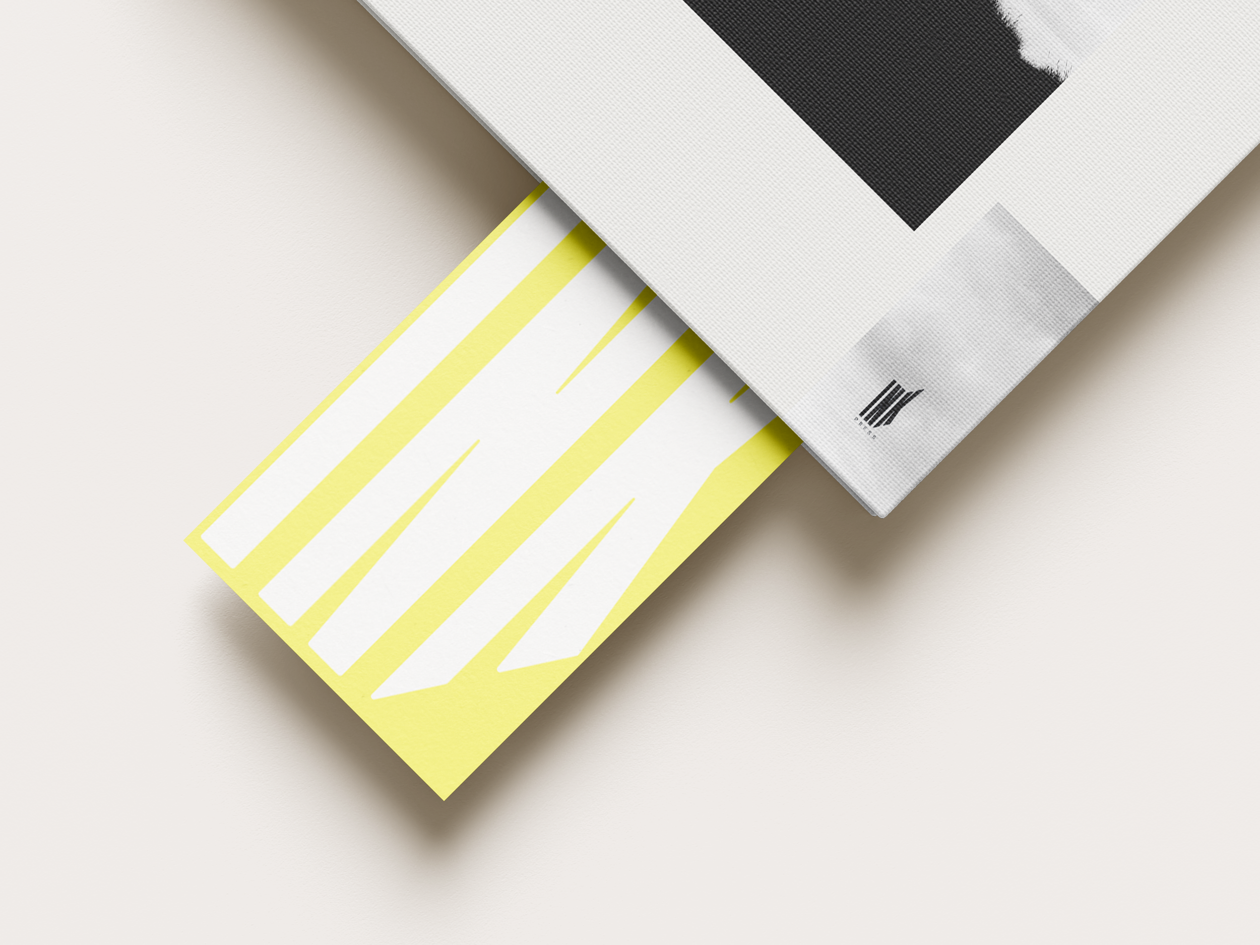
Ink Press is an independent book publisher committed to discovering and promoting young authors in the fiction industry. They produce smaller-scale book runs than larger companies, distributing books to other, independent book shops, and have their own physical shop alongside a strong online platform. They offer a subscription service, pushing out new authors to their followers, and using their brand appeal on merchandise to establish and maintain a cult following.
The client:
Briefly, their target demographic ranges from late teens to middle aged adults of all genders. Drawn in by striking, wearable visuals and an anti-industry feel, those likely to subscribe to an indie fiction company are likely to be supportive of “underdog” authors and businesses as they may feel they relate to. Their choices of apparel and home decor are often an even mix of both heavily ethically and aesthetically led.
They appreciate the craftsmanship behind limited-edition or small-batch publications, often preferring physical books with distinctive, artistic covers that reflect the uniqueness of the content within.
The company’s branding therefore must reflect these elements, translate smoothly across output channels in order to integrate itself into the mainstream book selling space without overstepping into a corporate style which would turn away the target market.
Logo and typeface considerations:
Pull from the small business, independent bookseller aesthetic. Tie together the heritage of print press companies and the modernity of contemporary fiction.
Utilise the ideology of an old printing press: block text, heavy weight, low contrast; to keep lines clean and minimal.
Introduce serif font for body text, drawing link back to classic print styles. Allows for a softer, more personal tone to come through in written media where the thick logo type may feel harsh.
Stylistically, the logo wants to appear as though it could act as a stamp that could be seen in the front of a library book, or debossed into a classic book spine for example.
In order to avoid straight white or black in favour of, softer tones, the off-white shade has been chosen carefully to reflect novel paper, while the rich black is more likely to invoke the feeling of ink. The same can be said for the navy, with the striking yellow being brought in as a stark, modern opposite. The lemon tone is brought through by adding a touch of magenta and cyan rather than running a solid 0/0/100/00, neon yellow.


